Maroon is a rich, warm, and sophisticated colour that can instantly add character to a room. Whether you are decorating a living room, bedroom, dining area, or accent wall, choosing the right maroon colour combination can make the space feel elegant and inviting. While maroon has a naturally bold appearance, pairing it with softer or contrasting shades can create a balanced and visually appealing interior.
From classic combinations such as maroon and cream to contemporary choices like maroon and grey, there are plenty of ways to use this versatile colour. The key is to select complementary shades according to the size, lighting, furniture, and overall style of your room.
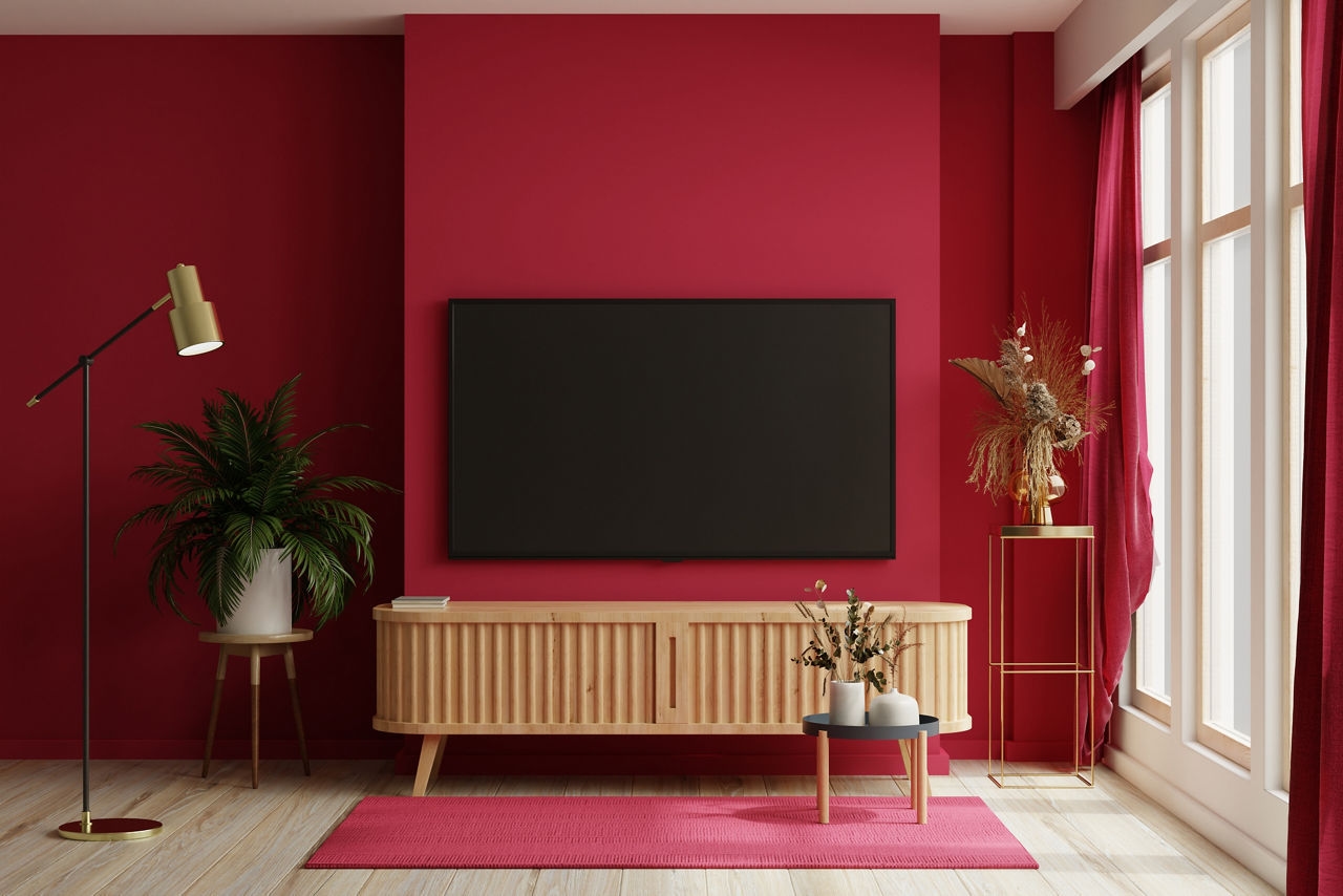
Why Choose Maroon for Your Walls?
Maroon is associated with warmth, richness, confidence, and elegance. It works particularly well when you want to create a strong focal point without making the entire room feel overwhelming. Instead of using maroon on every wall, homeowners can combine it with neutral or lighter shades to maintain balance.
A well-planned maroon colour combination can work in both traditional and modern interiors. It can add depth to a large living room, create a cosy bedroom atmosphere, or make a dining space look more sophisticated.
The effect also depends on the finish and amount of natural light available. In rooms with plenty of sunlight, deeper maroon shades can look dramatic and luxurious. In darker rooms, combining maroon with lighter colours can help maintain an open and comfortable appearance.
1. Maroon and Cream
Maroon and cream is one of the most timeless colour combinations for home interiors. Cream softens the intensity of maroon while allowing its rich character to stand out.
You can use maroon on one feature wall and cream on the remaining walls. This combination works particularly well in living rooms and bedrooms. Cream-coloured curtains, sofas, rugs, or cushions can further connect the two shades.
For a classic interior, consider adding wooden furniture and warm lighting to complete the look.
2. Maroon and White
If you want a clean and balanced interior, maroon and white can be an excellent choice. White creates a strong contrast against the depth of maroon and can make the room feel brighter.
One approach is to use maroon as an accent wall while keeping the other walls white. This is especially useful for rooms where you want the feature wall to become the main visual focus.
White furniture and simple decorative elements can maintain a fresh and modern appearance.
3. Maroon and Light Grey
Maroon and light grey offer a sophisticated contemporary look. Grey acts as a neutral background, allowing maroon to become a statement shade without dominating the entire room.
This maroon colour combination can work beautifully in modern living rooms, bedrooms, and home offices. Use maroon strategically through an accent wall, furniture, cushions, or decorative elements, while light grey covers the larger surfaces.
Metallic décor and minimalist furniture can complement this combination particularly well.
4. Maroon and Beige
Beige is another excellent partner for maroon because its warm neutral appearance creates a comfortable and welcoming atmosphere. The combination is suitable for homeowners who want a rich colour without making the room look too intense.
Try using beige on most walls and introducing maroon through one feature wall. Beige curtains, wooden flooring, and neutral furniture can help create a cohesive appearance.
This combination works especially well in living rooms, dining spaces, and bedrooms.
5. Maroon and Blush Pink
For a softer and more contemporary interior, consider pairing maroon with blush pink. The lighter pink shade balances the depth of maroon and gives the room a refined appearance.
This combination can work particularly well in bedrooms and creative spaces. To avoid making the room feel too colourful, keep larger furniture pieces in neutral shades and use maroon as an accent.
Soft lighting and simple décor can enhance the overall effect.
6. Maroon and Mustard Yellow
Maroon and mustard yellow create a warm and energetic interior. Both colours have strong visual personalities, so they should be used thoughtfully.
A maroon feature wall combined with mustard-coloured cushions, artwork, or décor can create an attractive focal point. This combination is suitable for spaces where you want warmth and personality.
For a balanced look, introduce neutral shades such as white, beige, or light wood alongside the two primary colours.
7. Maroon and Olive Green
If you prefer earthy interiors, maroon and olive green can provide an interesting and sophisticated combination. Both colours have a natural depth that works well with wooden furniture and indoor plants.
Use one shade as the dominant colour and the other as an accent. For example, maroon can be used on a feature wall while olive green appears through furnishings and décor.
This approach can give living rooms and bedrooms a warm, grounded feel.
8. Maroon and Gold
Maroon and gold are ideal for creating a luxurious and traditional appearance. Gold can be introduced through lighting fixtures, decorative frames, cushions, furniture details, or other accessories.
Because both shades can be visually strong, avoid using too much gold. A maroon wall with subtle golden accents can be enough to create an elegant atmosphere.
This maroon colour combination can be particularly effective in formal living rooms, dining rooms, and festive interior designs.
How to Choose the Right Maroon Colour Combination
Before selecting your colour palette, consider the characteristics of your room. The amount of natural light is particularly important. A room receiving limited sunlight may benefit from pairing maroon with cream, white, or another light neutral.
Room size also matters. In smaller spaces, using maroon on a single wall can create a focal point while keeping the remaining walls lighter. Larger rooms provide more flexibility and can accommodate deeper colour combinations.
You should also consider your existing furniture and flooring. If your furniture has strong colours or patterns, neutral walls can help create balance. On the other hand, simple furniture can allow a maroon accent wall to become the centrepiece.
Paint finish is another factor to consider. Depending on the room and desired appearance, you can explore different finishes that provide either a subtle or more prominent visual effect. Always test a shade in the actual room before committing because lighting can change how a colour appears.
When exploring paint options and colour ideas, products from established paint brands such as JK Maxx Paints can also be considered based on your room requirements and preferred finish.
Tips for Using Maroon Without Overpowering the Room
Maroon is a bold shade, so thoughtful application is important. Here are some simple tips:
Use maroon as an accent colour if you want a subtle effect.
Pair deep maroon with lighter neutral shades.
Consider the natural and artificial lighting in the room.
Coordinate curtains, furniture, and décor with the wall palette.
Use metallic accents carefully for a premium appearance.
Avoid combining too many strong colours in one room.
Test paint samples before painting the complete wall.
Final Thoughts
Choosing the right maroon colour combination can transform an ordinary room into a warm, stylish, and distinctive space. Whether you prefer the timeless appeal of maroon and cream, the modern contrast of maroon and grey, or the luxurious character of maroon and gold, there is a combination to suit different interior styles.
The best results come from maintaining balance. Let maroon provide depth and personality while lighter or neutral shades create visual breathing space. By considering room size, lighting, furniture, and décor before selecting your palette, you can create an interior that feels cohesive, comfortable, and visually appealing.