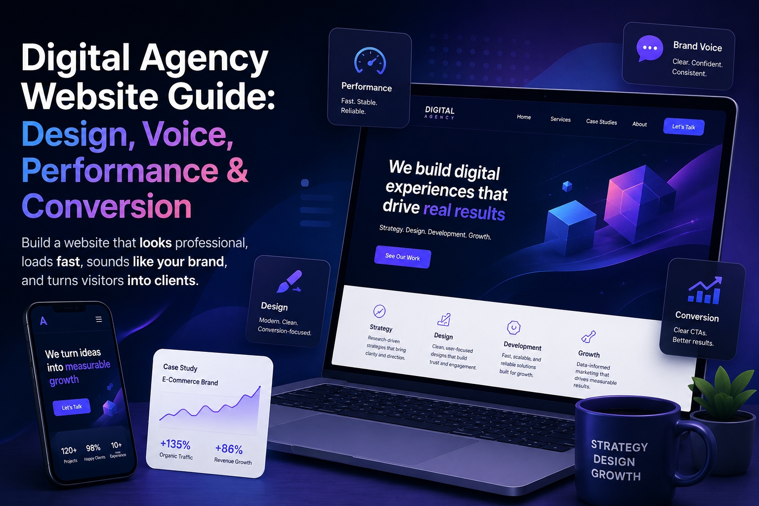
A digital agency website has to do more than look polished. Visitors do not judge it only by the homepage design, the portfolio grid, or the words in the hero section. They judge the whole experience: how quickly the site responds, how clearly the offer is explained, how confidently the agency sounds, and how naturally each page leads them toward the next step.
This is where many agency websites become weaker than they first appear. The design may be modern, the visuals may be clean, and the services may be listed correctly. But the site can still feel inconsistent. One page sounds strategic, another sounds generic. The homepage feels confident, but the service pages feel vague. The blog attracts visitors, but does not connect them to the agency’s positioning. The website may even load well in one test, then feel slower or less stable in real use.
For agencies, this matters because the website itself becomes proof of the agency’s thinking. A visitor is not only reading about design, SEO, branding, content, or development. They are experiencing how the agency organizes information, handles trust, explains value, and removes friction. If the website feels unclear, slow, or inconsistent, it quietly weakens the promise the agency is trying to make.
A stronger agency website works like one connected system. The visual foundation should support credibility. The performance should feel stable. The brand voice should make the agency recognizable. The tone of voice should make the message more persuasive. The conversion path should help the visitor understand what to do next without feeling pushed.
That is why building an effective digital agency website is not just a design task. It is a strategy task. The goal is not to create a site that only looks professional at first glance. The goal is to create a website that feels consistent, fast, clear, and trustworthy from the first visit to the final call to action.
Why Agency Websites Often Look Good but Still Feel Weak
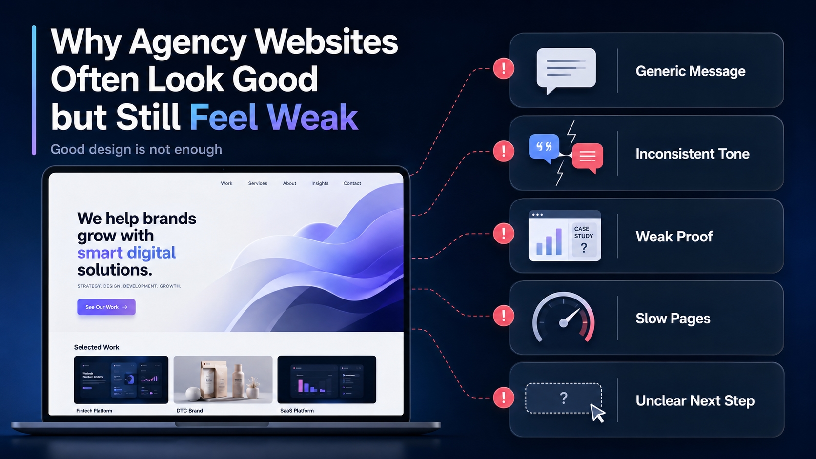
Many digital agency websites create a strong first impression. They use clean layouts, bold headlines, polished visuals, smooth animations, and confident service sections. At a quick glance, everything looks professional. The problem is that a professional look does not always create a persuasive experience.
A visitor usually feels this gap before they can explain it. The site may look modern, but the message feels too general. The homepage may promise growth, strategy, creativity, or better results, but the service pages do not clearly explain how that value is delivered. The portfolio may show attractive projects, but the case studies do not prove enough about the agency’s thinking, process, or impact.
This is one reason agency websites can feel weaker than their design suggests. They often focus heavily on visual presentation while leaving the deeper structure underdeveloped. The design says “we are professional,” but the copy does not say enough about why the agency is the right choice. The layout looks organized, but the visitor journey does not always move naturally from interest to trust to action.
Another common issue is inconsistency between pages. The homepage may sound sharp and strategic, while the blog sounds generic. A service page may use confident sales language, while the contact page feels cold or unclear. Case studies may use a different tone again. None of these differences may seem serious on their own, but together they make the website feel less like one brand and more like a collection of separate pages.
Performance can create the same kind of weakness. A site may look impressive when it first loads, but if some pages respond slowly, if mobile browsing feels heavier, or if dynamic sections lag, the visitor’s confidence drops. This is especially important for agencies because the website is not only a marketing asset. It is also evidence of the agency’s standards.
A weak agency website usually does not fail because of one obvious mistake. It fails because several small gaps work together:
the design looks better than the message sounds;
the services are listed but not clearly positioned;
the tone changes from page to page;
the portfolio shows work but does not build enough trust;
the site feels fast in some moments and slow in others;
the calls to action appear before the visitor has enough confidence;
the blog attracts attention but does not support the agency’s offer.
The result is a website that feels correct but not convincing. Visitors can understand what the agency does, but they may not feel a strong reason to continue. They may like the design, but still hesitate to contact the team. They may read a page, but leave without remembering what makes the agency different.
For a digital agency, this is a serious problem because the website is often the first proof of expertise. If the agency claims to build strategy, clarity, performance, branding, content, or conversion systems for clients, its own website has to demonstrate those qualities. A site that only looks good is not enough. It also needs to feel consistent, stable, specific, and easy to trust.
The Four Layers of a Strong Agency Website
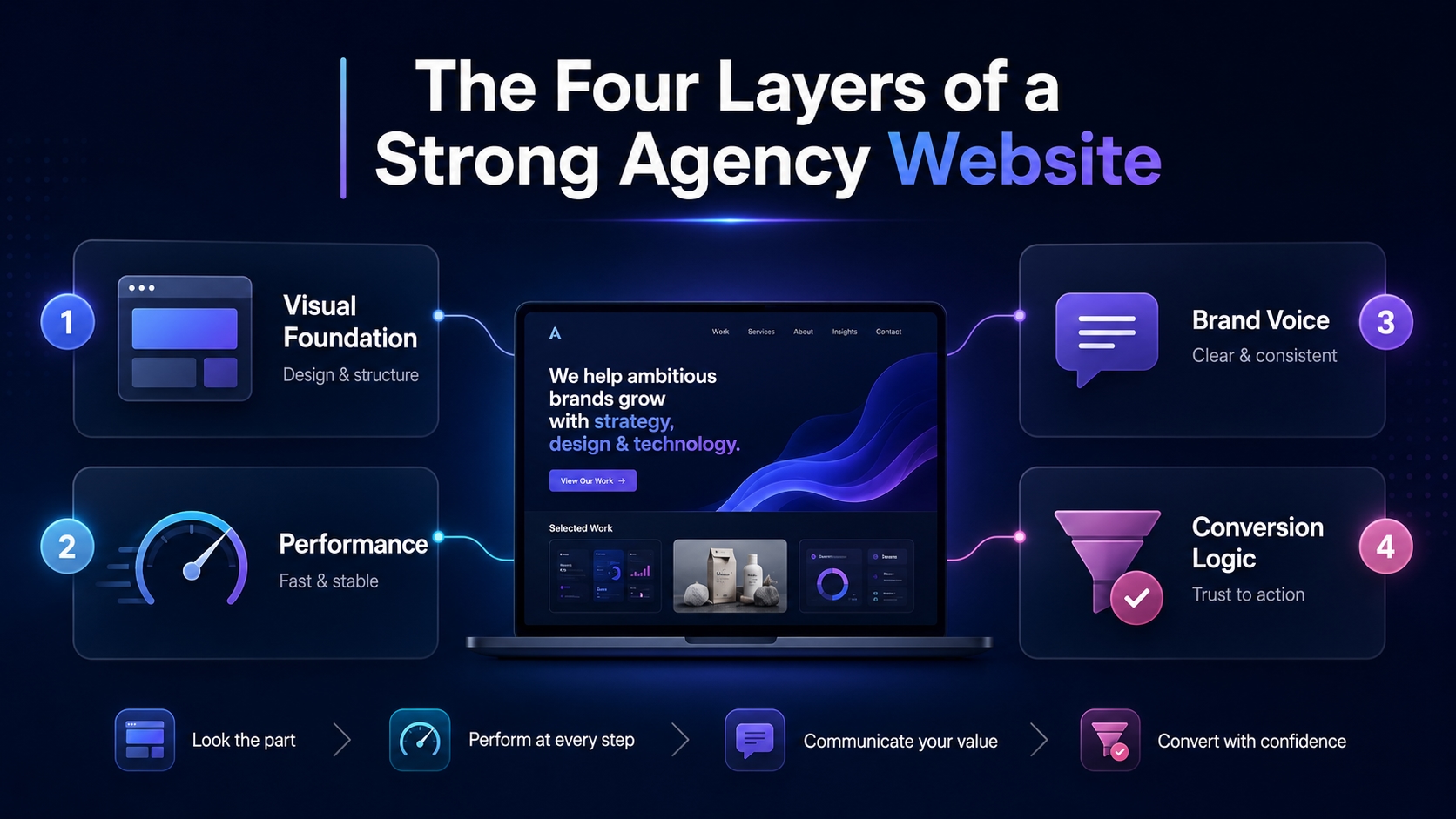
A strong agency website works as one system, not as a set of separate pages. Good design helps, but it cannot carry the whole experience alone. Visitors also need clarity, speed, trust, and a clear reason to take the next step.
The first layer is the visual foundation. This includes the theme, layout, typography, spacing, page structure, and first impression. A good visual base makes the agency look credible before the visitor reads deeply.
The second layer is performance. The site should feel stable across key pages, not only fast in one speed test. If the homepage loads well but service pages, blog posts, or forms feel slow, the experience becomes inconsistent.
The third layer is brand voice. The agency should sound recognizable across the homepage, service pages, case studies, blog, and contact page. If every section sounds like it was written by a different team, trust becomes weaker.
The fourth layer is conversion logic. Each page should help the visitor understand the offer, see proof, and move toward action. A CTA works better when the website has already built enough confidence.
These four layers support each other:
visual foundation creates the first impression;
performance protects attention;
brand voice builds recognition;
conversion logic turns interest into action.
When one layer is weak, the whole website feels less convincing. When they work together, the agency website feels faster, clearer, and more trustworthy.
Start With the Right Visual Foundation, Not Just a Pretty Homepage
The visual foundation shapes the first impression before the visitor reads deeply. Layout, typography, spacing, colors, navigation, and page structure all influence whether the agency feels credible, organized, and easy to understand.
For many agencies, WordPress is a practical base because it can support the main parts of an agency website:
homepage;
service pages;
case studies;
blog content;
landing pages;
contact forms;
lead capture blocks.
A good theme can make this structure easier to build. It gives the site a visual rhythm and helps the agency present its services more clearly. This overview of digital agency WordPress themes can help compare useful starting options:
https://medium.com/@wwwebadvisor/best-digital-agency-wordpress-themes-mostly-free-a4f64e0bd03f
But a theme is not the whole strategy. It cannot fix a vague offer, generic copy, weak service pages, or an unclear visitor journey. A polished design can make the site look professional, but it cannot make the agency sound specific by itself.
The visual foundation should support clarity. The visitor should quickly understand:
who the agency helps;
what problems it solves;
what services it offers;
what proof supports the offer;
what step to take next.
When design supports the message, the website feels stronger. When design replaces the message, the site may look good but still fail to persuade.
Make Performance Feel Stable, Not Just Fast in a Test
Speed matters, but stability matters even more. An agency website should not only load well once in a testing tool. It should feel reliable across real pages, real devices, and real visitor behavior.
A site can feel inconsistent when:
the homepage loads faster than service pages;
blog posts become heavy because of images or scripts;
contact forms respond slowly;
mobile pages feel less smooth than desktop pages;
the site slows down when more visitors arrive;
cached pages perform well, but dynamic pages feel weak.
This is a problem for agencies because performance affects trust. If a visitor clicks from the homepage to a service page and the experience suddenly becomes slower, the site feels less professional. If the contact page lags, the conversion path becomes weaker.
A useful way to understand this problem is to look at why website performance can feel inconsistent in real use, even when the site seems optimized in a test:
https://volodymyrzh.medium.com/why-website-performance-is-inconsistent-88d33b1a6eba
For an agency website, performance should support the whole visitor journey:
fast first impression;
smooth service pages;
stable blog experience;
responsive forms;
reliable mobile browsing.
The goal is not only to chase a perfect score. The goal is to make the website feel dependable. When performance is stable, visitors can focus on the offer instead of noticing friction.
Define the Brand Voice Before Writing Service Pages
Service pages should not sound like a list of generic offers. They need a clear voice that matches how the agency wants to be perceived: strategic, direct, calm, expert, creative, technical, or consultative.
Without defined brand voice, the website can become uneven:
the homepage sounds confident;
service pages sound vague;
blog posts sound too neutral;
case studies sound like reports;
CTAs feel disconnected from the rest of the site.
Before rewriting key pages, it helps to define the brand voice as a system. This step-by-step guide explains how to do that in a practical way:
https://seolabsdp.blogspot.com/2026/04/how-to-define-brand-voice-step-by-step.html
A strong brand voice helps the agency keep the same character across the whole website. It guides how the brand explains problems, presents solutions, handles claims, and invites visitors to act.
For agency websites, this matters because clients are not only buying a service. They are judging how clearly the agency thinks. When the voice is consistent, the site feels more reliable, focused, and easier to trust.
Use Tone of Voice to Make the Website More Persuasive
Brand voice defines the system. Tone of voice shows how that system works on real pages. It affects headlines, service descriptions, CTAs, case studies, contact forms, and even short microcopy.
A digital agency can sound:
clear instead of clever;
confident instead of loud;
expert instead of complicated;
helpful instead of generic;
direct instead of pushy;
specific instead of vague.
This matters because small wording choices can change how visitors feel about the agency. “Let’s grow your business” may sound broad and forgettable. A more specific line can explain the problem, show confidence, and make the next step feel safer.
Once the brand voice is defined, the next step is to apply it in real website copy. These tone of voice examples show how wording can make conversion-focused content clearer and more believable:
https://seolabsdp.blogspot.com/2026/04/tone-of-voice-examples-that-convert.html
Tone should not feel like decoration. It should help the visitor understand the offer faster. A good agency website uses tone to make every important message more useful:
homepage headline explains the value;
service page copy reduces confusion;
CTA feels natural;
case study sounds credible;
contact page lowers hesitation.
When tone supports conversion, the website stops sounding like a template. It starts feeling like a real agency with a clear point of view.
Connect Design, Speed, and Voice Into One Visitor Journey
Visitors do not experience an agency website as separate blocks. They move through one journey: first impression, page speed, headline, service explanation, proof, and call to action.
If one part feels weak, the whole journey becomes less convincing.
A strong visitor journey should feel connected:
the homepage explains the agency’s value clearly;
service pages continue the same message;
case studies prove the claims;
blog content supports the agency’s expertise;
contact pages remove friction;
performance stays stable across the path.
This is where design, speed, and voice must work together. Design makes the site easier to scan. Performance keeps attention. Voice makes the message recognizable. Conversion logic tells the visitor what to do next.
The goal is not to make every page sound identical. A case study can be more specific. A blog post can be more educational. A contact page can be more direct. But the agency should still feel like the same brand everywhere.
When the journey is consistent, the website feels more trustworthy. Visitors understand the offer faster, move between pages with less friction, and have a clearer reason to take the next step.
Build Service Pages Around Problems, Proof, and Process
Service pages should do more than name what the agency offers. A page called “SEO,” “Branding,” “Web Design,” or “Content Marketing” is not enough by itself. The visitor needs to understand why the service matters, how the agency approaches it, and what makes the offer credible.
A strong service page should usually include:
the problem the client recognizes;
the cost of leaving that problem unsolved;
the agency’s method;
what the service includes;
proof, examples, or outcomes;
a clear next step.
This structure makes the page easier to trust. Instead of saying “we provide digital marketing services,” the agency explains the situation the client is facing and shows how the service helps solve it.
The strongest service pages are specific. They do not try to sound impressive with broad claims. They explain the client’s problem in plain language, show the agency’s process, and make the next action feel logical.
Good service pages also need consistency. The voice should match the homepage. The proof should support the offer. The CTA should feel natural, not sudden. When problem, proof, and process work together, the page becomes more persuasive without sounding forced.
Make Case Studies Sound Specific Instead of Decorative
Case studies should not work like a gallery. A nice screenshot, a short description, and a client logo may show that the project exists, but they do not always prove why the agency was valuable.
A stronger case study explains the thinking behind the work:
what problem the client had;
why that problem mattered;
what the agency changed;
how the process worked;
what result or improvement followed;
what the project shows about the agency’s approach.
This makes the case study more persuasive. The visitor can see not only the final output, but also the agency’s ability to diagnose, plan, solve, and improve.
The tone should stay specific and credible. Case studies become weaker when they sound too polished, too vague, or too exaggerated. Phrases like “we transformed the brand” or “we delivered amazing results” need context. What changed? Why was it difficult? What did the agency actually do?
A useful case study should connect back to the service offer. If the project supports web design, SEO, branding, content, or performance work, the page should make that connection clear. This helps the visitor move from proof to action.
When case studies show real problems, real decisions, and real outcomes, they stop being decoration. They become trust-building assets inside the website journey.
Keep Blog Content Aligned With the Agency’s Positioning
A blog should not feel like a separate SEO project attached to the agency website. It should support the same positioning as the homepage, service pages, and case studies.
Blog content can attract early-stage visitors, but it should still lead somewhere useful. Each article should help the reader understand the agency’s expertise, point of view, and approach.
A strong agency blog should:
answer real search questions;
connect the topic to the agency’s services;
use the same brand voice as the main website;
link to relevant service pages or case studies;
avoid generic advice that any agency could publish;
move the reader toward a clearer next step.
This does not mean every article must be sales-focused. Educational content can still build trust. The key is to make sure the blog does not sound disconnected from the agency’s main message.
When blog content supports positioning, it does more than capture traffic. It helps visitors see how the agency thinks before they ever contact the team.
Create a Practical Agency Website Consistency Checklist
Before changing the whole website, the agency should check whether the main parts already work together. A consistency checklist helps reveal small gaps that weaken trust.
The website should answer these questions clearly:
Does the homepage explain who the agency helps?
Is the main offer clear within the first screen?
Do service pages use the same voice as the homepage?
Are case studies specific enough to prove expertise?
Does the blog support the agency’s positioning?
Are key pages fast and stable on mobile?
Do CTAs feel natural instead of forced?
Is the contact path simple and easy to follow?
Do internal links move visitors toward useful next pages?
This checklist is useful because agency websites often fail through small inconsistencies, not one major mistake. The homepage may be strong, but service pages may feel vague. The blog may attract traffic, but not guide readers further. The design may look polished, while the message still feels unclear.
A strong website does not need every page to look or sound identical. But every page should feel like part of the same system. When the message, design, performance, proof, and CTA support each other, the website becomes easier to trust.
What to Fix First if the Website Already Exists
If the agency already has a website, a full redesign is not always the first step. It is better to find where the experience breaks: speed, message, page structure, proof, or conversion path.
Start with the most visible problems:
check whether key pages load smoothly on desktop and mobile;
review the homepage message;
compare the tone across service pages, blog posts, and case studies;
check whether each service page explains a real client problem;
make sure case studies show proof, not just visuals;
test whether the contact path feels simple;
update CTAs that sound generic or disconnected.
This order helps avoid cosmetic fixes. A new layout will not solve unclear positioning. Better copy will not fully help if key pages feel slow. Stronger CTAs will not work if the visitor has not seen enough trust signals.
The goal is to improve the system, not only individual pages. Fix the parts that block trust first. Then refine design, content, internal links, and conversion elements around one clear agency message.
Conclusion: A Strong Agency Website Should Feel Like One System
A strong agency website is not just a polished homepage, a portfolio, and a contact form. It should feel like one connected system where design, speed, message, proof, and conversion logic support each other.
The visual foundation creates the first impression. Stable performance protects attention. Brand voice makes the agency recognizable. Tone of voice makes the message more persuasive. Service pages, case studies, blog content, and CTAs then guide the visitor toward action.
When these parts work separately, the website may look professional but still feel weak. When they work together, the site becomes easier to understand, easier to trust, and easier to act on.
For a digital agency, that consistency matters. The website is not only a marketing channel. It is proof of how the agency thinks, explains, organizes, and delivers value. A site that feels clear, fast, and persuasive makes the agency’s promise more believable before the first conversation even starts.
FAQ
What makes a good digital agency website?
A good digital agency website should clearly explain who the agency helps, what problems it solves, and why its approach is credible. It should combine strong design, stable performance, clear service pages, specific case studies, consistent brand voice, and natural calls to action.
Why can an agency website look good but still fail to convert?
An agency website can look good but fail to convert when the message is vague, the service pages are generic, the visitor journey is unclear, or the site feels inconsistent across pages. Design creates the first impression, but conversion usually depends on clarity, trust, proof, and timing.
Why is website performance important for digital agencies?
Website performance affects trust. If an agency website feels slow, unstable, or inconsistent, visitors may question the agency’s standards. This is especially important because the website itself works as proof of how the agency handles digital experience.
Is a WordPress theme enough to build a strong agency website?
A WordPress theme can provide a strong visual foundation, but it is not enough by itself. The agency still needs clear positioning, useful service pages, strong copy, proof, stable performance, and a consistent brand voice.
What should an agency service page include?
An agency service page should explain the client’s problem, why the problem matters, how the agency solves it, what the service includes, what proof supports the offer, and what the visitor should do next. This makes the page more persuasive than a simple list of services.
How does brand voice affect an agency website?
Brand voice helps the agency sound recognizable across the homepage, service pages, blog, case studies, and CTAs. When the voice is consistent, the website feels more focused and trustworthy. When it changes from page to page, the site can feel disconnected.
What is the difference between brand voice and tone of voice?
Brand voice is the stable character of the brand. Tone of voice is how that character adapts to specific situations. For example, the same agency can sound educational in a blog post, direct on a service page, and reassuring on a contact page while still keeping the same overall voice.
How can case studies make an agency website more persuasive?
Case studies become persuasive when they show the problem, the agency’s thinking, the process, and the outcome. They should not only display finished work. They should help visitors understand how the agency solves problems and why its approach works.
Should an agency blog focus only on SEO traffic?
No. An agency blog can attract SEO traffic, but it should also support positioning. Each article should connect to the agency’s expertise, services, or point of view. Otherwise, the blog may bring visitors without helping them understand why the agency is relevant.
What should agencies fix first on an existing website?
Agencies should first check the parts that most directly affect trust: page speed, homepage clarity, service page structure, tone consistency, case study quality, contact flow, and CTAs. A full redesign is not always necessary if the main problem is message, structure, or performance.


