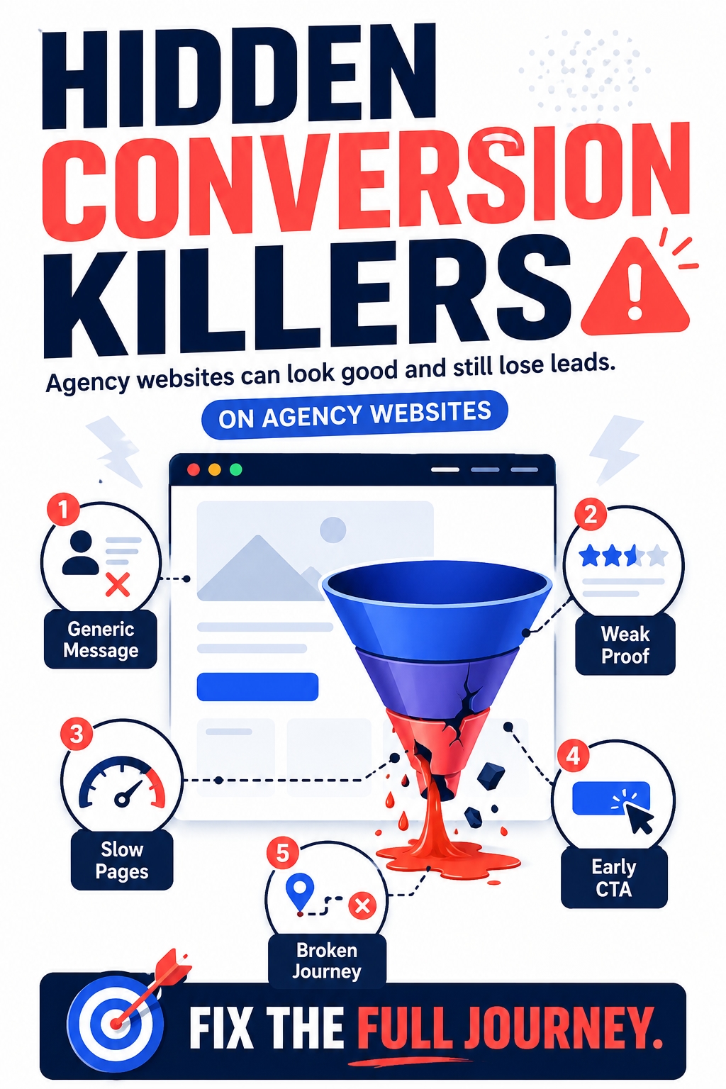
A digital agency website can look polished and still fail to generate serious leads. It may have a modern homepage, strong visuals, case studies, service pages, and a clear “Book a call” button, but visitors still leave without taking action.
The problem is often not one obvious mistake. Conversion can break because the website feels generic, slow, inconsistent, or unclear. A headline may sound impressive but explain very little. A service page may list tasks instead of outcomes. A case study may show results without proving how the agency solved the problem.
For digital agencies, this matters because the website is also proof of their thinking. Before a client books a call, they judge the agency’s strategy, communication, taste, and technical standards through the site itself. This article looks at the hidden conversion killers that quietly weaken agency websites and make potential clients move on.
A Good-Looking Website Can Still Be a Weak Sales Asset
Many digital agency websites are built around appearance first. The homepage looks sharp, the animations feel modern, the portfolio section is visually impressive, and the service names sound professional. But a polished website is not automatically a persuasive website. Design can create attention, but it cannot replace clear positioning, useful proof, and a logical path toward action.
This is where many agency websites become weak. They show that the agency can design, write, build, or market, but they do not clearly explain why a specific client should choose them. The visitor may understand that the agency offers web design, SEO, branding, or digital marketing, but still not understand what kind of problem the agency is best at solving.
A portfolio-style website usually answers one question: “What have we made?” A stronger sales asset answers more important questions:
Who do we help?
What problem do we solve?
Why does this problem matter?
How do we approach it differently?
What should the visitor do next?
Without those answers, the site may look credible but still feel replaceable. A visitor can admire the design and still leave because the offer is not specific enough. This is one reason agency websites need more than visual polish. They need consistency between the message, structure, speed, proof, and conversion path.
A stronger agency website should feel connected from the first impression to the final call to action. The homepage, service pages, case studies, blog content, and contact page should not feel like separate pieces written for different purposes. They should guide the visitor through one clear experience. This is also why it helps to think about how digital agencies can build websites that feel consistent, fast, and persuasive across the whole journey:
https://drukarnia.com.ua/articles/how-digital-agencies-can-build-websites-that-feel-consistent-fast-and-persuasive-mWwy3
Conversion Killer #1 — Generic Positioning
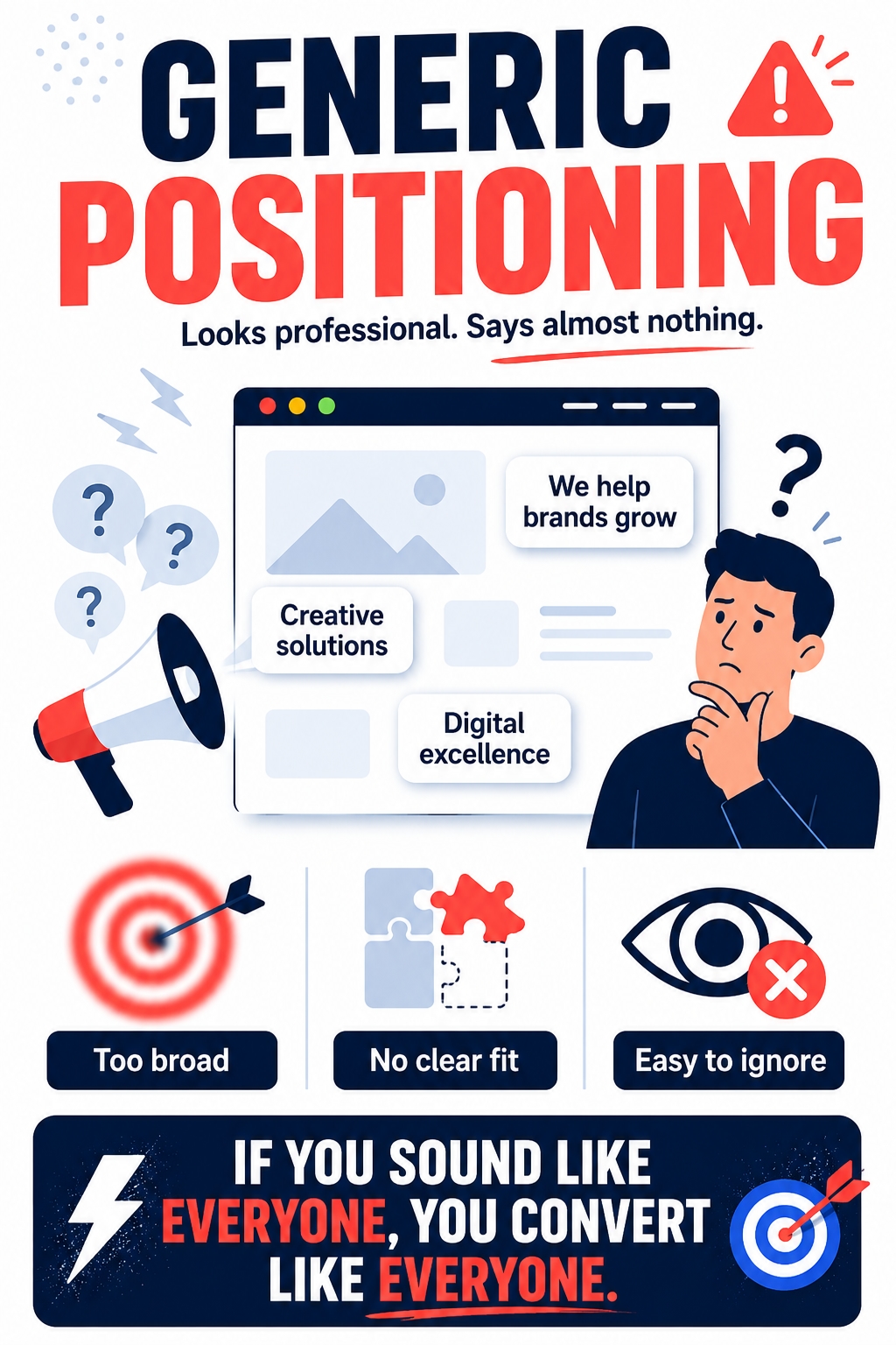
One of the most common conversion killers on digital agency websites is generic positioning. The website may sound professional, but it does not sound specific. It uses familiar phrases like “we help brands grow,” “we create digital experiences,” “we build powerful solutions,” or “we are a full-service digital agency.” These lines are safe, but they rarely give the visitor a strong reason to trust the agency.
Generic positioning usually happens when an agency tries to appeal to everyone. The message becomes broad because the agency does not want to lose potential clients. But the result is often the opposite. When the offer is too broad, visitors cannot quickly understand whether the agency is right for their problem, industry, budget, or stage of growth.
A stronger agency website should make the value easier to recognize. It should explain who the agency helps, what problems it solves, and what kind of result it is built around. This does not mean the agency has to limit itself to one tiny niche. But it does mean the website should give visitors enough context to understand why this agency is not just another option.
Generic positioning often fails because it does not answer the questions that matter most:
Who is this agency best suited for?
What problem does it understand deeply?
What kind of outcome can a client expect?
How is its process different from a standard vendor?
Why should the visitor keep reading instead of comparing ten more agencies?
The clearer the positioning, the easier it becomes for the rest of the website to work. Service pages become more focused. Case studies become more relevant. Calls to action feel more natural. Even blog content becomes easier to connect to the buyer journey because the agency knows what kind of client it wants to attract.
Without clear positioning, every other conversion element has to work harder. The design has to impress more. The copy has to explain more. The CTA has to push harder. But when positioning is specific, the website can feel more confident without becoming aggressive.
Conversion Killer #2 — Inconsistent Brand Voice
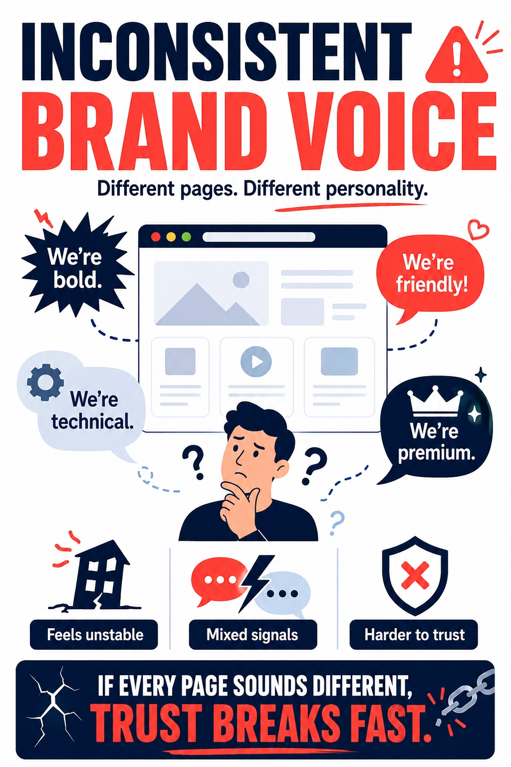
Another hidden conversion killer is inconsistent brand voice. A digital agency website can have strong individual pages, but still feel unstable if those pages sound like they belong to different companies. The homepage may sound bold and strategic. The service pages may sound dry and technical. The blog may sound casual. The case studies may sound generic. The contact page may suddenly become pushy.
This creates a quiet trust problem. Visitors may not consciously think, “This brand voice is inconsistent.” But they can feel that the website lacks a clear personality and communication standard. For an agency, that matters because clients are not only evaluating the offer. They are also evaluating how the agency thinks, explains, frames problems, and communicates.
Brand voice is not just a writing detail. It helps the website feel coherent. When the voice is clear, the agency can adapt its tone to different pages without losing its identity. A homepage can be confident, a case study can be analytical, a blog post can be educational, and a CTA can be direct, while still sounding like the same brand.
Inconsistent voice usually appears when there is no shared rule for how the agency should speak. Different pages are written at different times, by different people, for different short-term goals. Over time, the site becomes a collection of separate texts instead of one connected experience.
Before rewriting service pages, case studies, or calls to action, it helps to define the brand voice step by step. A practical voice system gives the agency rules for clarity, confidence, tone, vocabulary, examples, and phrases to avoid:
https://seolabsdp.blogspot.com/2026/04/how-to-define-brand-voice-step-by-step.html
Once the voice is defined, the website becomes easier to strengthen. Headlines can feel more recognizable. Service pages can explain value more consistently. Case studies can sound more credible. CTAs can become clearer without feeling aggressive. The goal is not to make every page sound identical. The goal is to make every page feel like it comes from the same agency.
Conversion Killer #3 — Service Pages That List Tasks Instead of Outcomes
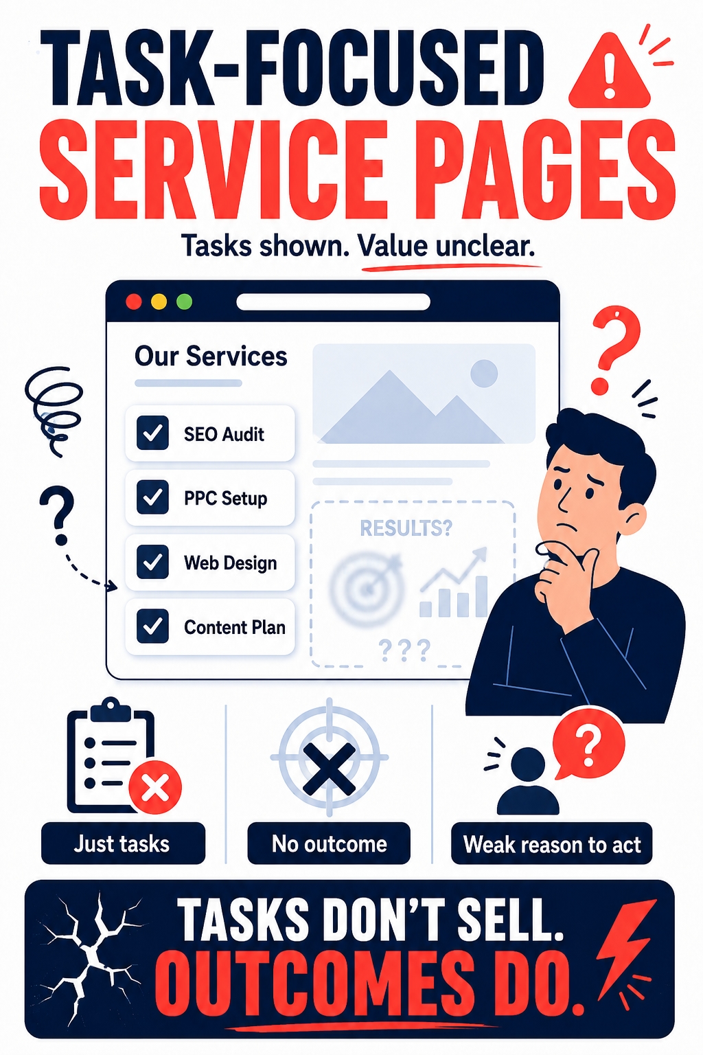
Many agency service pages are too task-focused. They say the agency offers web design, SEO, branding, PPC, content, or development, but they do not clearly explain why those services matter to the client’s business. The page becomes a menu, not a sales argument.
A visitor does not only want to know what the agency can do. They want to understand what problem will be solved, what will improve, and why this team is a good fit. If the page only lists deliverables, it forces the visitor to connect the dots alone.
A stronger service page should explain:
the business problem behind the service;
who the service is best suited for;
what symptoms show the client needs it;
how the agency approaches the work;
what outcome the client should expect.
For example, “website redesign” is only a task. A stronger angle would connect it to unclear positioning, weak lead generation, poor UX, slow pages, or outdated trust signals. That makes the service easier to understand as a business solution, not just a design project.
This is where many agency websites lose qualified leads. The visitor may need the service, but the page does not make the need feel urgent or specific. Instead of building confidence, it leaves the offer too flat.
A good service page should move from problem to process to proof. It should make the client feel understood before asking them to book a call.
Conversion Killer #4 — Weak Proof and Empty Case Studies
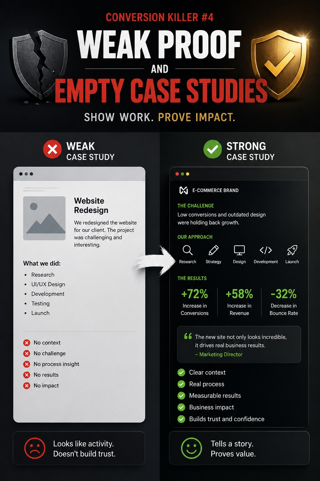
Case studies should make an agency easier to trust. But many agency websites use them only as visual portfolio items. They show a client logo, a few screenshots, and a short result, but they do not explain the real story behind the work.
A weak case study often feels incomplete because it misses the context. It may say that traffic increased, conversions improved, or a new website was launched, but the visitor still does not know what problem existed before, what the agency changed, or why the result mattered.
A stronger case study should answer:
what the client was struggling with;
why the problem was important;
what strategy the agency used;
what changed after the work;
what a similar client can learn from it.
The goal is not to show off every detail. The goal is to prove thinking. Potential clients want to see how the agency understands problems, makes decisions, handles constraints, and connects creative or technical work to business outcomes.
Empty proof weakens conversion because it makes the agency harder to compare. If every case study sounds like “we helped a brand grow,” the visitor has no clear reason to believe this agency is different. Strong proof should make the agency’s process visible, not just its final visuals.
A good case study does not only say, “Look what we made.” It says, “Here is the problem we understood, the decision we made, and the result that followed.”
Conversion Killer #5 — Slow Pages That Break Momentum
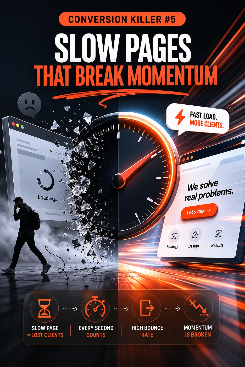
Speed is not only a technical issue. On a digital agency website, speed is part of trust. If the site loads slowly, jumps while opening, or feels heavy on mobile, the visitor starts doubting the agency before reading the offer properly.
This is especially damaging when the agency sells design, development, SEO, UX, or performance-related services. A slow website quietly creates a contradiction between what the agency promises and what the visitor experiences.
Slow pages can hurt conversion because they:
interrupt the visitor’s attention;
make the website feel less professional;
weaken trust in technical competence;
reduce the chance that users will explore more pages;
make CTAs less effective because fewer visitors reach them.
The problem is often worse on pages that matter most: homepage, service pages, case studies, and contact pages. These pages usually contain large visuals, scripts, animations, embeds, tracking tools, and design effects. Each element may seem small, but together they can make the site feel slower than it should.
A fast agency website does not need to feel plain. It needs to feel controlled. Visual polish should support the sales journey, not slow it down. If performance breaks the visitor’s momentum, even strong copy and good case studies may not get enough attention.
Conversion Killer #6 — CTAs That Ask Too Early
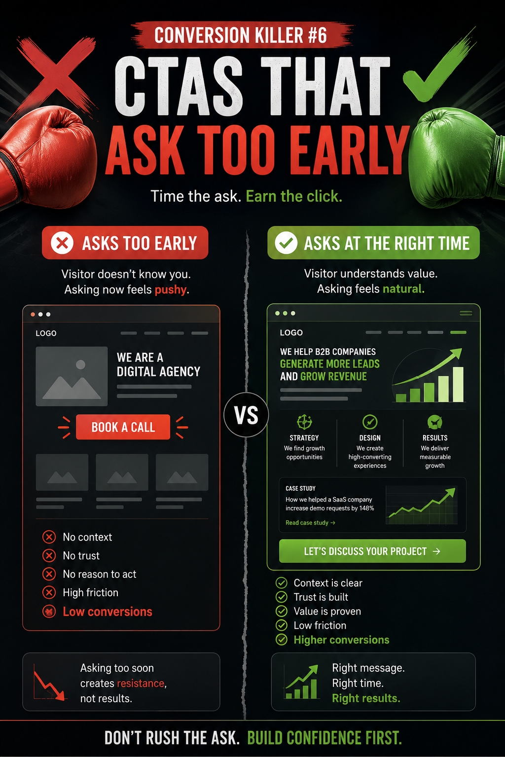
A call to action can be visible and still be poorly timed. Many agency websites ask visitors to “Book a call” or “Get a proposal” before they have explained enough value. The button is there, but the reason to click is not strong yet.
This does not mean every CTA should be hidden at the bottom of the page. It means the CTA should match the visitor’s level of trust. A new visitor may not be ready to book a call after one headline and a hero image. They may first need to understand the agency’s focus, process, proof, and fit.
Early CTAs often fail when they appear before:
the problem is clearly explained;
the agency’s value is specific;
the visitor sees relevant proof;
the process feels understandable;
the next step feels low-risk.
A better CTA flow gives visitors smaller steps before asking for commitment. For example, a homepage can invite them to explore the agency’s approach. A service page can guide them to see the process. A case study can show proof. Then the final CTA can ask for a call when the visitor has enough context.
The strongest CTAs do not feel like pressure. They feel like the next logical step after trust has already been built.
Conversion Killer #7 — Blog Content That Does Not Support the Buyer Journey
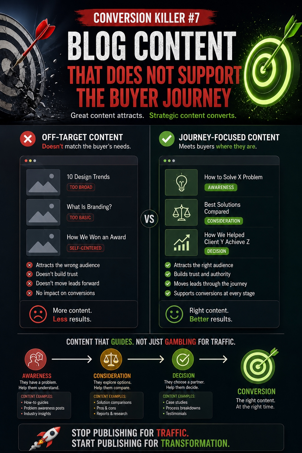
An agency blog should not exist only to publish SEO articles. It should help the right visitors understand their problems, compare solutions, trust the agency’s thinking, and move toward a service page or contact step.
Many agency blogs fail because the topics are too random. One post is about trends, another is about tools, another is a company update, and another targets a keyword that has no connection to the agency’s services. This may bring some traffic, but it does not always support conversion.
A weak agency blog often has these problems:
topics are disconnected from services;
articles do not link to relevant service pages;
posts attract readers who are not potential clients;
content explains ideas but does not guide the next step;
the blog has no clear role in the sales funnel.
A stronger blog works as part of the buyer journey. It can answer early questions, explain common mistakes, show how the agency thinks, and prepare readers for deeper pages. For example, an article about weak website conversions can naturally lead to service pages about web strategy, UX, copywriting, or redesign.
The goal is not to turn every blog post into a sales pitch. The goal is to make content useful and connected. If the blog attracts attention but never moves readers closer to trust, it becomes a traffic asset without a conversion role.
Conclusion — Conversion Is Built Before the CTA
A digital agency website does not convert only because it has a polished design and a visible contact button. Conversion starts much earlier. It begins when a visitor quickly understands what the agency does, who it helps, why the offer matters, and why the agency can be trusted.
Most hidden conversion killers are not dramatic. They are small gaps that quietly weaken confidence. Generic positioning makes the agency sound replaceable. Inconsistent brand voice makes the website feel less stable. Weak service pages fail to connect work with outcomes. Empty case studies show activity without proving thinking.
The strongest agency websites do not push visitors harder. They explain better. They connect pages more clearly. They make proof easier to understand and the next step feel natural.
When the message, voice, structure, speed, proof, and CTA work together, the website stops acting like a portfolio. It becomes a sales asset that helps the right clients feel ready to start a conversation.

