In today's competitive breakfast cereal market, packaging design plays an important role in attracting attention and building a recognizable brand. A cereal box must do more than protect the product. It should communicate the brand's personality, present important product information, and give shoppers a reason to notice it among competing products.
One popular approach is bear-themed cereal packaging. A friendly bear mascot can make a cereal box look playful, welcoming, adventurous, or family-oriented. When combined with carefully selected colors, clear typography, creative illustrations, and a consistent marketing strategy, the character can become an important part of the brand's identity.
However, an attractive bear illustration alone is not enough to create effective packaging. Businesses must also consider their target audience, product positioning, printing requirements, package structure, and promotional activities.
Let's explore some practical bear-themed cereal box design ideas and marketing strategies that brands can use to develop more distinctive and memorable packaging.
1. Start With a Clear Bear Mascot Concept
Before choosing colors or designing the cereal box, businesses should decide what their bear mascot represents. The character's personality should match the cereal's target audience and overall brand positioning.
For example, a cheerful bear holding a bowl of cereal may suit a family-oriented breakfast brand. An adventurous bear wearing a backpack could support a playful outdoor theme, while a gentle, minimalist bear illustration might complement a premium oat cereal.
A strong mascot concept should include several defining features:
A recognizable facial expression and body shape.
A consistent color palette and illustration style.
A personality that reflects the product's identity.
Distinctive details that differentiate the character from generic artwork.
Flexibility to appear across different flavors and marketing materials.
Brands can look at established examples for inspiration. Post Consumer Brands' Golden Crisp cereal demonstrates how Sugar Bear serves as part of a recognizable cereal brand identity.
The goal is not to copy an existing character. Instead, businesses should develop original artwork that gives their own product a distinctive personality.
A well-planned mascot can also make future packaging updates easier because designers have a familiar character around which to build new campaigns.
2. Choose Colors That Complement the Bear Mascot
Color selection can influence the way shoppers interpret a package. A warm, golden palette may complement a honey-flavored cereal, while bright contrasting shades can make a playful product look more energetic.
The colors should support both the bear character and the cereal itself.
Honey and Oat Theme
Brown, golden yellow, and cream can create a warm presentation suitable for honey or oat cereal. Honey illustrations, grain patterns, and a friendly brown bear can reinforce the theme.
Chocolate Cereal Theme
Dark brown, light cream, and selected bright accents can help communicate a chocolate flavor. A mischievous bear or a character enjoying a bowl of cereal may give the packaging a playful appearance.
Fruit Cereal Theme
Bright red, orange, blue, or purple accents can help distinguish fruit-flavored varieties. The bear can remain consistent while the surrounding colors change to represent different flavors.
Whole-Grain Theme
Muted green, beige, and natural brown tones can support a more understated design. Grain illustrations and a simpler bear mascot may suit a cereal positioned around whole grains.
Color choices should be tested rather than based entirely on assumptions. A 2026 meta-analysis published in the Journal of the Academy of Marketing Science, Unpacking Packaging: A Meta-Analysis on the Effects of Visual Packaging Elements, reviewed 280 studies examining visual packaging features such as color, imagery, size, shape, logos, materials, and typography.
Its findings reinforce the importance of considering packaging elements together and matching the design to the intended outcome.
For manufacturers, this means evaluating how the bear, background, product imagery, and brand name work as a unified visual system.
3. Create a Clear and Attractive Front-Panel Layout
A cereal box has limited space, so every element should have a clear purpose. The mascot should attract attention without making the product name or important information difficult to find.
A practical front-panel design can include:
Brand logo: Place the brand name where shoppers can recognize it quickly.
Product name: Use readable lettering that clearly identifies the cereal variety.
Bear mascot: Give the character enough space to remain recognizable without overwhelming the package.
Flavor illustration: Use appropriate images of cereal pieces, fruit, chocolate, honey, or other relevant ingredients.
Supporting information: Include truthful product features or relevant claims without overcrowding the design.
Typography also deserves attention. Rounded lettering can complement a friendly cartoon bear, while clean, simple fonts may work better for a premium product.
Designers should consider the package from different viewing distances. From across a supermarket aisle, shoppers might notice the overall color and the bear's face first. At closer range, they should be able to read the product name and examine the details.
Research published in Cognitive Research: Principles and Implications explores how visual communication works through food and beverage packaging design. The review discusses how visual characteristics such as color, shape, typography, and the arrangement of elements can communicate product associations.
Applying these principles helps create cereal packaging that looks organized rather than cluttered.
4. Explore Creative Bear-Themed Packaging Ideas
A bear mascot can support several packaging concepts. The right direction depends on the cereal's flavor, audience, price positioning, and brand personality.
Adventure-Inspired Cereal Boxes
An adventurous bear could explore mountains, forests, or imaginary landscapes. Supporting illustrations might include trees, trails, stars, or other elements that reinforce the theme.
This approach can give the packaging a sense of movement and provide creative opportunities for future product variations.
Honey-Loving Bear Designs
A bear holding a honey jar can create a recognizable theme for honey-flavored cereal. Golden colors, honeycomb patterns, and grain illustrations can support the product's visual presentation.
Designers should ensure that any ingredient-related illustrations and claims accurately reflect the product.
Interactive Packaging
The back panel could include a simple maze, puzzle, word game, or short character story. This provides a creative use for the space while maintaining the connection between the mascot and the brand.
Any activity should remain appropriate for the intended audience and should not obscure required product information.
Seasonal Bear Packaging
Limited-edition designs can show the mascot participating in seasonal activities or wearing different accessories. For example, the bear could appear with autumn leaves, winter clothing, or springtime illustrations.
Seasonal artwork can refresh the package while preserving the character's familiar appearance.
Premium Bear Illustrations
Not every bear-themed cereal needs bright cartoons. A refined illustration, restrained palette, and minimalist layout can create a different visual personality.
This can be useful for brands that want the character to feel more sophisticated rather than strongly focused on children's entertainment.
These concepts provide starting points for creative development. Before finalizing a direction, businesses should check whether the design suits their product and can be reproduced effectively in production.
5. Develop Packaging That Supports Different Cereal Flavors
Brands with multiple products can use a consistent bear mascot to connect their packaging range.
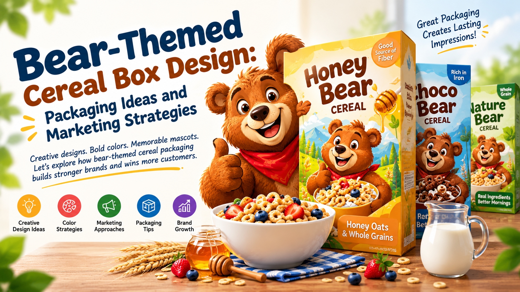
Imagine a manufacturer offering honey cereal, chocolate cereal, and a fruit-flavored variety. Each package could feature the same recognizable bear while using a different color palette and supporting imagery.
The honey version could use warm golden shades, the chocolate version could use deeper brown tones, and the fruit version could incorporate brighter colors.
This strategy helps establish a relationship between products without making them visually identical.
The same principle applies to the character itself. Designers might change the bear's pose slightly to reflect a flavor or seasonal theme, but its most distinctive features should remain recognizable.
Businesses exploring a cereal with bear on box concept can use this approach to combine mascot artwork, flavor differentiation, and practical packaging considerations.
The complete package should communicate what the product is, which variety it represents, and how it relates to the rest of the brand's range.
6. Use Storytelling to Strengthen Brand Recognition
A bear mascot becomes more versatile when it has a defined personality and story.
Instead of using the bear as a static image, a brand might develop a character who enjoys adventures, discovers new breakfast flavors, or brings humor to everyday breakfast routines.
This story can continue across multiple communication channels.
On the cereal box, the bear introduces the product. On a website, the character might appear in brand illustrations or product descriptions. On social media, the same mascot could appear in seasonal graphics or short, playful campaigns.
Consistency is important because every new use of the character should reinforce the same general identity.
The brand should also maintain ownership and usage guidelines for its original artwork. These can cover approved colors, proportions, poses, typography, and acceptable variations.
A coherent character identity gives the marketing team a reusable visual asset and provides designers with a clear framework for future packaging updates.
7. Marketing Strategies for Bear-Themed Cereal Boxes
Effective packaging should support the wider marketing strategy rather than operate independently from it.
Maintain Consistency Across Channels
Use the same core mascot, colors, logo, and visual style across packaging, product pages, promotional graphics, and advertising materials.
A consistent presentation makes it easier for shoppers to connect the different marketing materials with the same brand.
Build an Attractive Online Product Presentation
Online shoppers may first encounter a cereal through a small product image rather than a physical supermarket shelf.
Create clear product photographs that show the front of the box, the mascot, the product name, and relevant packaging details. Additional images can display the side and back panels where appropriate.
The design should remain recognizable at smaller sizes. Excessive text and fine details that disappear in thumbnail images should be avoided.
Introduce Seasonal and Limited-Edition Variations
Seasonal packaging can offer a reason to refresh campaign materials. The bear can participate in a new theme while retaining its most recognizable features.
Before investing in a large production run, businesses should evaluate whether the limited edition serves a clear marketing purpose and fits their production schedule.
Encourage Responsible Customer Engagement
A character can support simple activities, storytelling, or educational content associated with the cereal. Interactive features should be age-appropriate, transparent, and relevant to the product.
Brands targeting children should pay particular attention to responsible marketing. The Federal Trade Commission's advertising and marketing guidance explains that advertising claims must be truthful and evidence-based, including when businesses advertise to children or market child-oriented products to parents.
Test Before Launching
Instead of assuming that the brightest or most elaborate design will perform best, businesses can compare a small number of carefully developed concepts.
Useful evaluation criteria include mascot visibility, product-name readability, brand recognition, flavor identification, and clarity of the front panel.
Where practical, teams can test physical mockups and digital product images before committing to a full production run.
8. Keep Packaging Functional and Informative
Attractive graphics are important, but the cereal box must also perform its practical role.
The box dimensions should accommodate the product and any required inner packaging. Its material and structure should suit normal handling, storage, shipping, and shelf display.
Printing quality is another important consideration. Fine facial details in the bear illustration, small typography, and subtle color differences should remain clear after printing and folding.
Before production, manufacturers should review samples for:
Color accuracy and print consistency.
Mascot visibility and image quality.
Readable product names and supporting text.
Appropriate dimensions and structural strength.
Clear placement of ingredients, allergens, and other required product information.
For businesses selling food in the United States, the FDA's food-labeling and nutrition guidance provides useful information about applicable labeling requirements.
Requirements differ across countries, so manufacturers should check the rules for their intended markets.
Sustainability can also be part of the design process. Businesses can evaluate material efficiency, printing and finishing options, and compatibility with local recycling systems. The WRAP organization provides resources on packaging design, waste reduction, and circular-economy practices.
The objective is to create a cereal box that combines visual appeal with suitable protection, clear information, and practical performance.
9. Learn From Other Food Packaging Categories
The principles behind successful cereal packaging can also be useful when considering other food categories.
For example, smalls cat food provides a separate context for considering product identity and packaging communication.
Although cereal and pet-food products have different audiences and packaging requirements, both need a clear visual hierarchy and a recognizable presentation. The branding should help customers understand which product they are looking at rather than leaving them confused by unnecessary graphics.
For cereal brands, a bear mascot can be the central character in that system. Its artwork should work with the brand logo, product name, color palette, and relevant product information.
The key lesson is to create a coordinated packaging design in which every element contributes to the same identity.
10. Common Mistakes to Avoid
Even an imaginative design can lose effectiveness when the packaging is poorly planned.
Overcrowding the box: Too many graphics, badges, and slogans make it harder to understand the product.
Using an indistinct mascot: A generic bear may not create a recognizable identity. Original artwork and consistent character features can help differentiate the brand.
Ignoring the product itself: Flavor illustrations, colors, and promotional claims should remain relevant to the actual cereal.
Changing the mascot too frequently: Major changes to the character's face, proportions, or signature details may weaken visual continuity.
Neglecting online presentation: Packaging artwork should remain clear in digital product images as well as on physical shelves.
Skipping sample reviews: A digital mockup cannot reveal every issue with printing, folding, color reproduction, and physical handling.
Making unsupported claims: Statements about ingredients, nutritional benefits, or environmental performance should be accurate and supported by suitable evidence.
Avoiding these problems allows the mascot to contribute to the overall brand experience rather than becoming a decorative element without a clear purpose.
Conclusion
Bear-themed cereal box design combines character development, color selection, visual hierarchy, packaging functionality, and marketing strategy. A distinctive bear can make the product more recognizable, help differentiate flavors, and provide a consistent visual element across packaging and promotional materials.
However, the character should always work alongside a clear product name, suitable colors, readable information, and a practical carton structure. Businesses should also consider how the design will perform across physical retail, online product listings, and future product variations.
For brands planning a new cereal range or improving existing packaging, investing in well-designed wholesale cereal boxes can help bring the complete concept together. Combining memorable artwork with practical packaging requirements gives manufacturers a strong foundation for presenting their products professionally and building a recognizable brand identity.