
Getting people to visit your website is only part of the job. They may arrive through Google, social media, paid ads, referrals, or links from other websites, but that traffic has little value if visitors leave before exploring your content, contacting you, or making a purchase.
There is rarely one simple answer to why visitors leave your website. A high website bounce rate can be caused by slow loading, confusing navigation, poor mobile usability, weak messaging, missing trust signals, or a page that simply does not match what the visitor expected to find.
The good news is that many of these problems can be identified and fixed without redesigning the entire website. Below are 10 of the most common reasons visitors leave a website, along with practical ways to reduce friction, improve the user experience, and give people a stronger reason to stay.
1. Your Website Loads Too Slowly
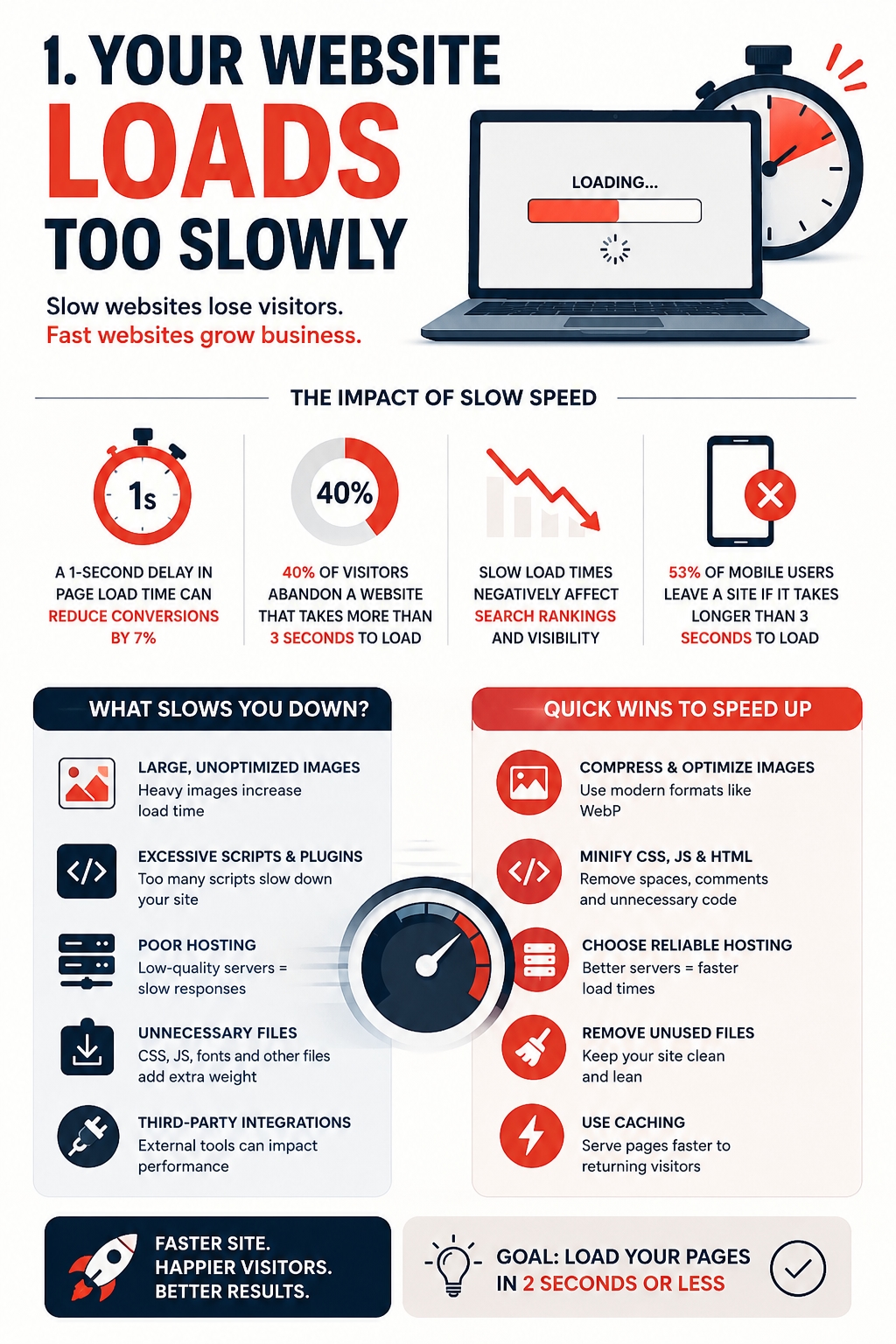
A slow website can lose visitors before they have a chance to understand what the business offers. When pages take too long to load, buttons respond with a delay, or content keeps moving while the page is opening, the experience immediately feels frustrating. This is especially noticeable on mobile devices, where users often expect to find information quickly and move on if they cannot.
Website performance also affects more than convenience. A slow or unstable website can make a business appear less polished and less reliable, even when the products or services themselves are good. The relationship between technical performance, user experience, and perceived credibility is explored in more detail here:
To fix the problem, start with the pages that receive the most traffic. Compress large images, remove unnecessary scripts, check hosting performance, and test Core Web Vitals. Improving the slowest parts of the website can reduce friction before you make any larger design or content changes.
2. Visitors Cannot Immediately Understand What You Offer
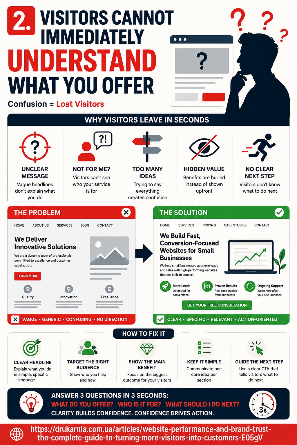
People rarely spend much time trying to work out what a website is about. If the main headline is vague, the value proposition is hidden behind generic marketing language, or the page tries to communicate too many ideas at once, visitors may leave even when the product or service could actually be useful to them.
A strong website should answer three basic questions almost immediately: what do you offer, who is it for, and what should the visitor do next? Clear website messaging reduces uncertainty and makes it easier for users to decide whether they are in the right place.
Review the first screen visitors see before they scroll. Replace broad claims such as “We deliver innovative solutions” with specific language that explains the actual service and its benefit. Support the main headline with a short description and one clear next step. Improving website clarity is often a much simpler fix than redesigning the entire page.
3. Your Navigation Makes Visitors Work Too Hard
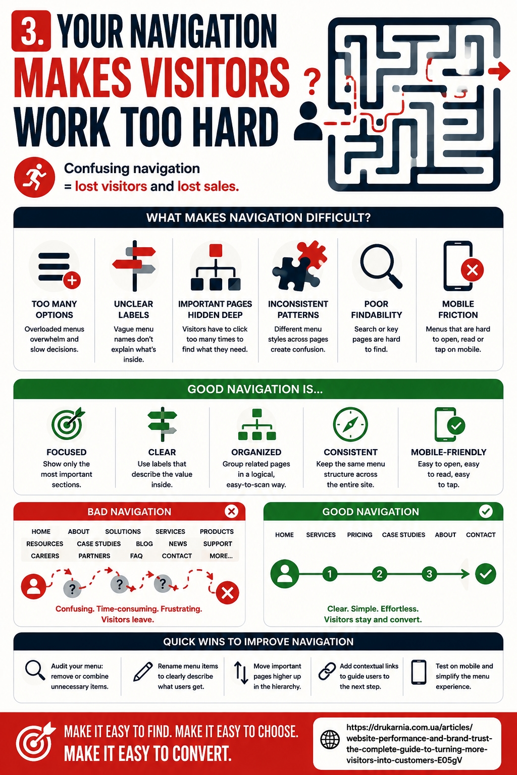
Even a well-designed website can lose users if they cannot quickly find the page, product, service, or information they need. Confusing website navigation creates unnecessary effort, and many visitors will leave rather than spend time working out where everything is located.
Common problems include menus with too many options, vague labels, important pages hidden several levels deep, and different navigation patterns across sections of the site. These issues contribute to a poor website user experience because every extra decision makes the journey feel more complicated.
Keep the main navigation focused on the pages that matter most. Use clear labels that describe what users will actually find, organise related pages logically, and add contextual internal links where they help visitors continue their journey. If an important service, pricing page, or contact option takes several clicks to reach, simplifying that path can make the website much easier to use.
4. The Mobile Experience Is Frustrating
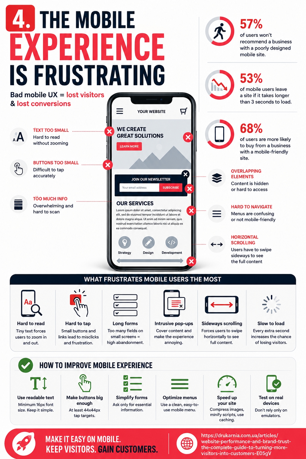
A website can work perfectly on a desktop and still drive visitors away on a phone. Poor mobile usability becomes especially damaging when users have to zoom in to read text, struggle to tap small buttons, deal with overlapping elements, or scroll sideways just to see the full page.
Mobile website experience also affects how quickly people can complete simple actions. A contact form that feels manageable on a laptop may become frustrating when it contains too many fields on a smaller screen. The same applies to navigation menus, comparison tables, pop-ups, and checkout pages.
Test important pages on real mobile devices instead of relying only on a responsive preview. Check whether text is easy to read, buttons are large enough to tap, forms are simple to complete, and the layout remains stable while loading. A mobile-friendly website should make the main customer journey feel just as clear and convenient as it does on desktop.
5. Your Website Does Not Feel Trustworthy
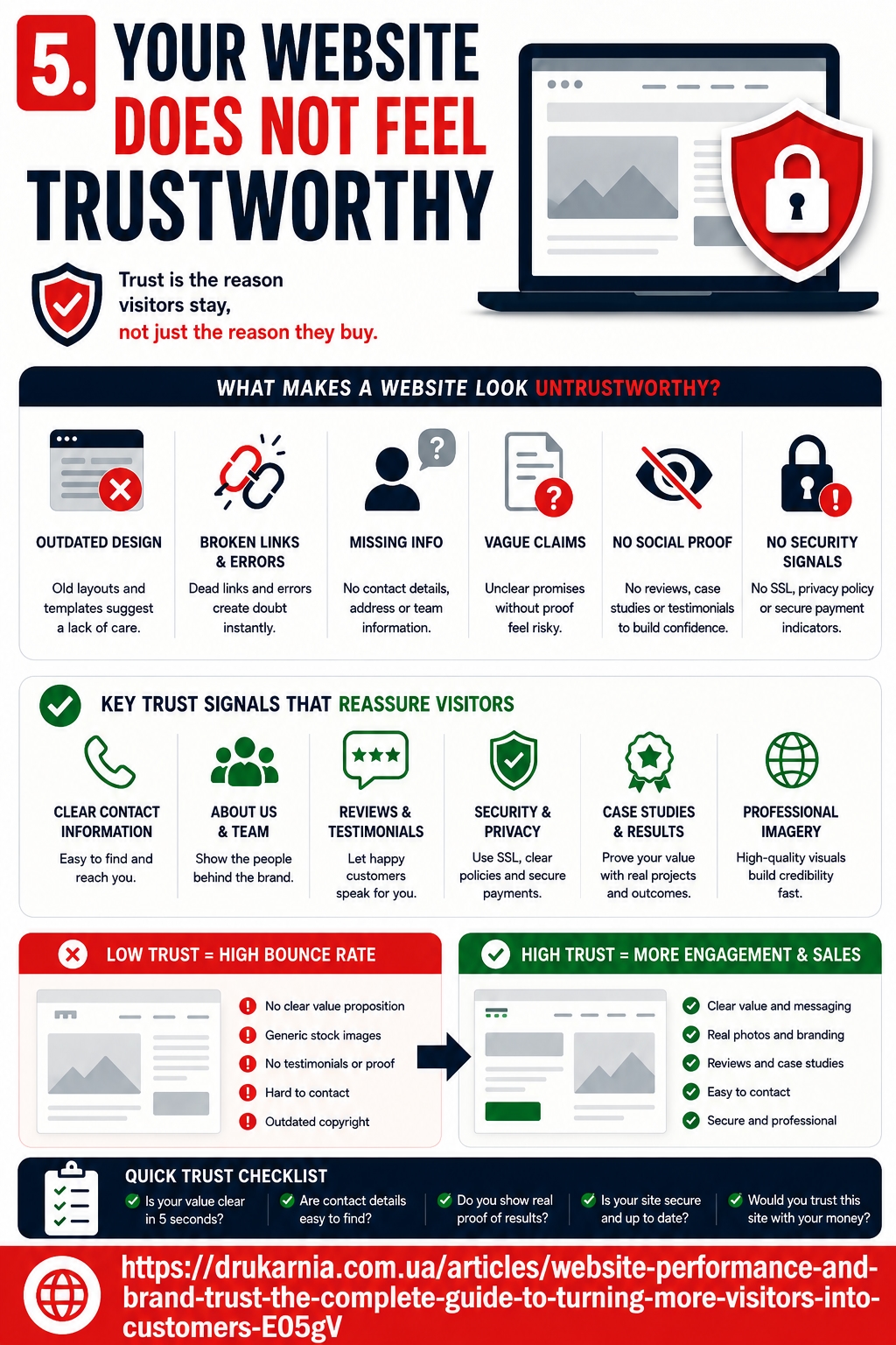
Visitors make quick judgements about website credibility. They may not consciously analyse every detail, but outdated pages, broken elements, inconsistent design, vague claims, or missing contact information can make a legitimate business feel less reliable. When users are being asked to share personal details, request a quote, or make a purchase, even small trust problems can become reasons to leave.
Useful website trust signals include clear contact information, customer reviews, case studies, transparent policies, professional imagery, consistent branding, and evidence that the site is actively maintained. Technical quality matters as well. Slow pages, unexpected layout shifts, and unreliable interactions can weaken the impression created by otherwise strong content and design.
The wider relationship between these technical issues and brand credibility is covered here:
Review important pages from the perspective of a first-time visitor. Look for anything that creates uncertainty and add credible proof where users are most likely to hesitate.
6. Pop-Ups and Interruptions Appear Too Soon
Pop-ups are not automatically bad for user experience. A well-timed subscription form, discount offer, or chat invitation can help a visitor take the next step. Problems begin when several interruptions appear before the user has had enough time to understand the page.
Imagine opening an article on a phone and immediately seeing a cookie banner, a newsletter pop-up, a chat window, and another promotional message. Even if every individual element has a purpose, together they create friction and make the page harder to use. Some visitors will simply close the tab rather than clear their screen.
Common interruptions worth reviewing include:
newsletter pop-ups that appear immediately after the page loads;
chat windows that automatically expand over the content;
promotional banners that take up a large part of the mobile screen;
repeated requests for notifications or account creation;
multiple calls to action competing for attention at the same time.
Instead of removing every pop-up, reconsider its timing and purpose. Let visitors read enough of the page to understand its value before asking them to subscribe or take another action. Exit-intent prompts, scroll-based triggers, and messages shown after meaningful engagement can often feel less intrusive.
One relevant prompt shown at the right moment is usually more effective than several messages fighting for attention.
7. Your Content Does Not Match Visitor Expectations
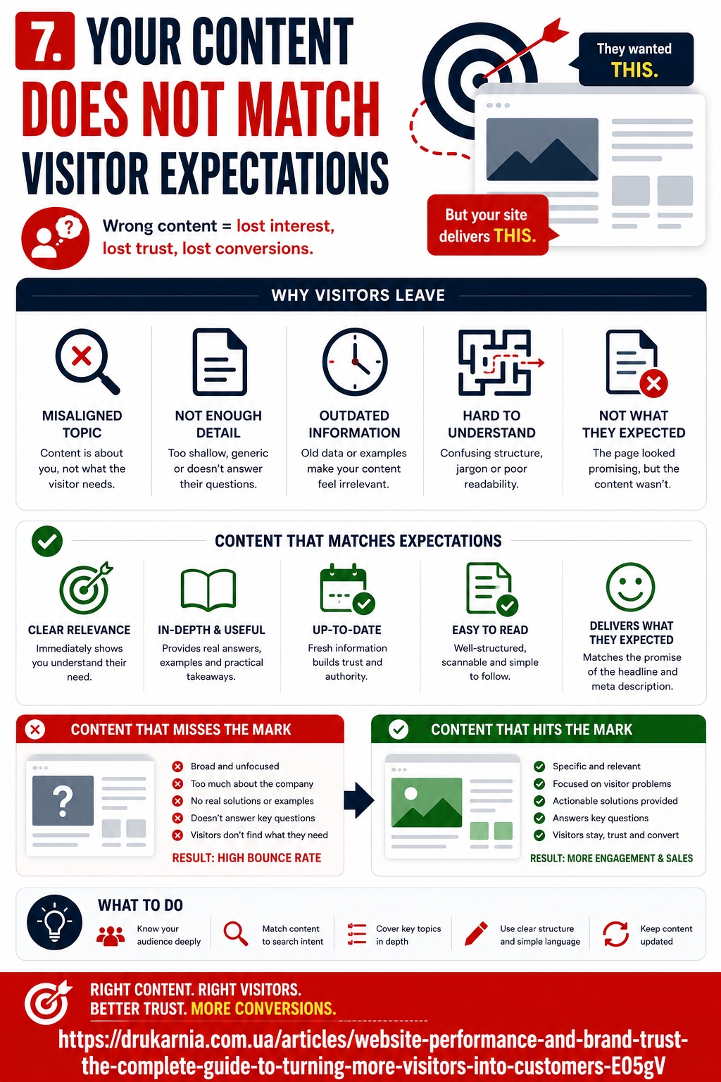
Visitors normally arrive with an expectation already in mind. Google search results, social posts, paid advertisements, emails, and links from other websites all create a promise about what someone will find after clicking.
If the destination page delivers something different, visitors may leave almost immediately.
For example, imagine a person searches for “affordable website design for small businesses” and clicks a result using that wording. If the destination is a generic agency homepage that says little about small businesses, pricing, or website design packages, the visitor has to work to find the information they expected.
The same problem can happen with informational content. An article promising a practical checklist should not open with hundreds of words of company promotion before reaching the checklist.
This mismatch is closely connected to search intent. A page can rank for a relevant keyword and still produce poor engagement if it does not satisfy the reason people searched for that keyword.
Compare the title, meta description, advertisement, or social post that sends traffic to each important landing page with the actual page content. The main headline and opening section should confirm quickly that the visitor has reached the right place.
Strong alignment between the traffic source and the destination can reduce website bounce rate without requiring more visitors. Sometimes the problem is not traffic volume at all — it is that the page fails to fulfil the promise that generated the click.
8. There Is No Clear Call to Action
Visitors can understand your offer, trust the business, and still leave because they are unsure what they should do next. A clear website call to action removes that uncertainty.
The appropriate CTA depends on the purpose of the page. A visitor reading an educational article is at a different stage from someone comparing products or examining a service page. Forcing every user towards the same action can therefore be just as ineffective as providing no direction at all.
Useful next steps might include:
Add to Basket for a product page;
Request a Quote for a service business;
View Pricing for someone evaluating options;
Book a Consultation for a higher-value service;
Compare Plans when several packages are available;
Read the Guide or See Related Resources for informational content.
The important thing is that the main action is easy to recognise. If a page contains five equally prominent buttons asking visitors to subscribe, buy, call, download, and read another article, the result may be decision paralysis rather than more conversions.
Look at each important page and ask what the most logical next step should be. Make that action visually clear and support it with secondary links only where they are useful.
When a website is not converting despite attracting relevant traffic, unclear or competing calls to action are one of the simplest elements to investigate.
9. Forms Ask for Too Much
A visitor who opens a form has already shown some level of interest. That makes form abandonment particularly frustrating: the website has brought the person close to converting and then introduced enough friction to make them reconsider.
Every additional field requires time and, in some cases, raises questions about why the information is needed. Asking for a full address, company size, telephone number, budget, job title, marketing preferences, and account registration may be reasonable later in a customer relationship, but it can feel excessive for a first enquiry.
Mobile devices make this problem even more noticeable. A form that seems manageable on a large monitor can require significant scrolling and typing on a phone.
Review which information is actually necessary to complete the current action. A first contact form may only need a name, email address, short message, and perhaps one field identifying the service required.
Make required fields obvious, use descriptive labels, provide helpful error messages, and ensure the form works smoothly on mobile devices. Where more information is necessary, consider breaking a complicated process into logical stages rather than presenting everything at once.
Reducing conversion friction does not mean collecting less useful information forever. It means asking for information at the point when the visitor has a reasonable reason to provide it.
10. Your Website Gives Visitors No Reason to Stay
Reducing website bounce rate should not become a goal of keeping every visitor on the site for as long as possible. Someone who finds a phone number and calls your business after thirty seconds may be far more valuable than someone who reads five pages and does nothing.
The more useful goal is to make the next relevant step easy to discover.
Someone finishing a service page may want to see prices, previous projects, customer reviews, FAQs, or a detailed case study. A visitor reading an educational article may want a related guide, comparison, calculator, or explanation of a more advanced topic.
If every page ends without providing a natural route forward, visitors have to return to the menu or search for the next piece of information themselves. Many will simply leave.
Use contextual internal links to connect closely related information. Add related resources when they genuinely help. On commercial pages, consider the questions users usually ask before contacting or purchasing and make those answers easy to reach.
This approach also improves website engagement more naturally than adding artificial mechanisms designed only to increase time on site. Good internal journeys work because each page helps the visitor answer the next question.
How to Find Out Why Visitors Are Leaving Your Website
General best practices are useful for identifying possible problems, but every website has a different audience, traffic mix, and customer journey. The most useful improvements come from combining those principles with actual user behaviour.
Start with your most important landing pages rather than attempting to analyse the entire website at once. Look at pages receiving meaningful organic, referral, social, or paid traffic and compare what happens after visitors arrive.
Analytics can help identify pages with weak engagement or unusually poor conversion performance. Compare mobile and desktop behaviour because a problem affecting one device may be hidden inside overall averages. Google Search Console can also reveal which queries are sending visitors to a page, helping you determine whether the content actually matches their search intent.
Heatmaps and session recordings can provide another perspective. They may reveal that visitors repeatedly click something that is not clickable, stop scrolling before an important section, struggle with a form, or abandon the page when a particular element appears.
You should also test important journeys manually. Open the website as if you were a first-time visitor and try to complete realistic tasks: understand the main offer, find a specific service, compare options, locate contact information, or submit an enquiry.
The objective is not simply to discover that a page has a high bounce rate. It is to find the point where useful visitors experience enough friction to stop moving forward.
Fix the Biggest Sources of Friction First
Once you understand why visitors leave your website, it can be tempting to create a long list of improvements and redesign everything at once. That usually makes it harder to determine which changes actually improve results.
Prioritise the problems that affect the largest number of relevant visitors or directly interfere with important actions. Slow loading, unclear messaging, confusing navigation, poor mobile usability, weak website trust, and difficult forms are generally more important than minor visual adjustments that do not change the user journey.
Start with the most important landing pages and conversion paths. Make one group of meaningful improvements, measure what happens, and then move to the next problem.
A lower website bounce rate can be a positive result, but it should not be treated as the only measure of success. Look at whether more visitors continue to useful pages, interact with important content, submit enquiries, complete purchases, or perform whatever actions matter to the website.
The best websites do not force people to stay. They remove unnecessary reasons to leave. When pages load quickly, communicate clearly, feel trustworthy, work properly on mobile devices, and provide an obvious next step, visitors can move through the site with far less friction.